Joys of Python and APIs
By Jasdeep Singh in API Charts google Programming Python
June 12, 2008
At my present job , Most of the time, I have to do changes in the legacy Java code to improve performance.
But this time i was asked to tell the extent of performance improvement due to my changes . I tried to use some Java Profiler , I tried Eclipse TPTP and HPROF but due to complacency of the legacy application. I was not able to profile my changes.
So i decided to keep it simple . Log the timestamps and analyze the result. But the log generated by this was unable to show any subsequent improvement in performance as I had to log time in Milliseconds ( System.nanoTime () could not be used for Java 1.4) .
For better time precesion i googled and found this timer library by Vladimir Roubstov.I tweaked it for my code and got the comprehesive log output.
Now to analyze the log, I wrote a python script that reads two log files and generates the time improvements in aggregation and for each run. This was the most exciting part.
for i in imap(lambda x,y:(x, y, x-y), [float(b) for b in new_list],[float(a) for a in old_list]):
print '%f - %f = %f' % i
```I wrote it in no time , [Python Rocks](http://www.google.com/search?q=python+rocks) . Then I decided to go one step further. What about plotting it on a graph. Straight away [Google Chart API](http://code.google.com/apis/chart/) came to my mind and there is [python wrapper](http://pygooglechart.slowchop.com/) to this. So I wrote this small function to produce graph for these logs.```
def draw_chart():
from pygooglechart import Axis,SimpleLineChart
chart = SimpleLineChart(600,200,
x_range=(0.000, 0.999), y_range=(0.000, 0.999))
chart.set_colours(['ff0000', '0000ff'])
chart.set_legend(['New','Old'])
chart.add_data([float(a) for a in old_list])
chart.add_data([float(b) for b in new_list])
chart.set_axis_range(Axis.LEFT, 0.000, 0.999)
chart.set_axis_range(Axis.BOTTOM, 1, 100)
chart.download('D:\\my_data.png')
```This is the graph generated for my data :```
[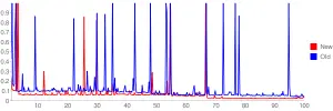](http://jasdeepsingh.files.wordpress.com/2008/06/my_data1.png)
```The graph does not show much improvement though , but the post was about joys of python and APIs :)
**P.S.** : There are [Java backports](http://backport-jsr166.sourceforge.net/) for using 1.5 > features like System.nanoTime().
_Crossposted from [https://jasdeepsingh.wordpress.com/2008/06/12/joys-of-python-and-apis/](https://jasdeepsingh.wordpress.com/2008/06/12/joys-of-python-and-apis/)_
---
### Comments:
#### [manmahesh](http:// "excellence11@gmail.com") - <time datetime="2008-06-12 14:46:16">Jun 4, 2008</time>
I didnt quite understand all this, you were right, it is geeky, nerdy, intelligent - in short everything that I am not. He he he. koshish karaa'n ta samjh aa wi jau. But I can sure try - with help of course.
<hr />
- Posted on:
- June 12, 2008
- Length:
- 2 minute read, 390 words
- Categories:
- API Charts google Programming Python
- See Also: